About Me
The enduring question of whether to write this bit in the first or third person. He wonders which I should choose.
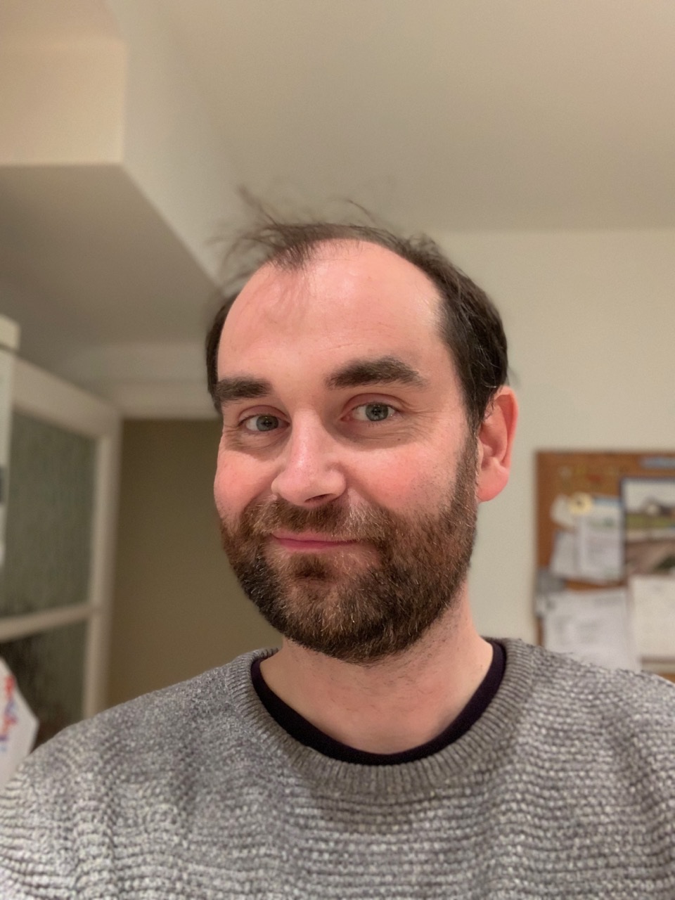
I'm Anthony. I am one of these new fangled Xennials. Old enough to have had an extensive collection of blank cassettes, young enough to have been making things for the web for over 20 years.
I built the foundations of my skills designing and building massive local government websites.
Then I spent many years working with big publishers at interconnect in Liverpool. The likes of the Telegraph and The Spectator. Until very recently The Spectator (and their many off shoots) was almost entirely my work - the design and the bulk of the front end code. I have spent a number of years honing a design platform/framework/design system for the publishing platform that powered most of our work.
Then a few years back I moved to Government work at the Department for Environment, Food and Rural Affairs (Defra). Initially as a Senior Interaction Designer, but over the past year or so I have moved in to Service Design. I should probably write a post about that at some point. I've been working on several pojects around floods and trying to improve how to better serve user needs around them. Mostly about becoming aware of them in the forst place.
I live on The Wirral. I have a wife and two kids. I like to write little reviews of beer on Instagram. I'm trying to get back into golf. Oh, and I have no large colon due to having Ulcerative Colitis. That's actually a good thing.
You can find me on Twitter. You can find me on Instagram. I'm barely on that LinkedIn thing.
Projects I have worked on:
The Spectator
From 2012 to around 2018 at interconnect we were the team behind The Spectator's web presence. Initially called in to migrate the publication from a broken CMS to WordPress. The team quickly went on to quickly build up the digital side of the business. When I joined in 2013 it wasn't long before we started to change the design of the site. There were numerous design and development augmentations over time until in 2016 we did a full redesign and front end build.

Liaising with the team at The Spectator and a small team of our Devs I was solely responsible for the design, and a large portion of the front end build of the site. During our we helped them to increase their monthly pageviews from 1 million to 10 million.
I was also responsible for the design and build of many of the Spectators other sites, such as Spectator Health, Spectator Events, Spectator Life and several others.
The companies parted ways but our work stayed in place for another 18 months or so. They finally moved to a new platform and design this year (April 2020). I'm glad to see that my fingerprints are still in the design language and it has progressed in positive way.
I wrote a proper case study about the redesign project for our site.
Our director, Dave, also wrote about the success we had.
Apollo Magazine
Apollo is another of Press Holdings' (the people behind The Spectator) titles. In their words 'Apollo is one of the world’s oldest and most respected magazines on the visual arts'.
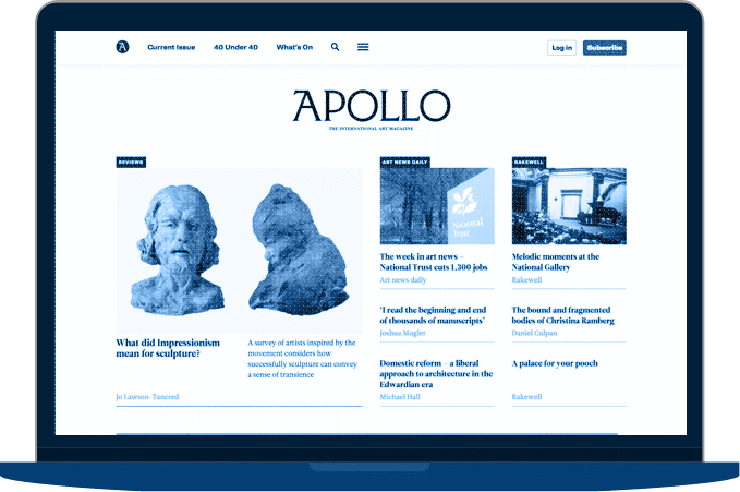
It was a pleasure to work on a site with such a strong visual aesthetic. I was responsible for the design and build of the site. It still remains largely as I designed it and it remains one of my favourite pieces of work.
The creation of it involved a meeting with Andrew Neil. Yes, that Andrew Neil.
The Telegraph: Project Babb
For the 2014 World Cup The Telegraph wanted to experiment with something a bit different to their usual coverage. They wanted a new platform that would allow their journalists to put out content more quickly than their main site could. Content that was more irreverent and fun, and catered for mobile users to share and go viral.
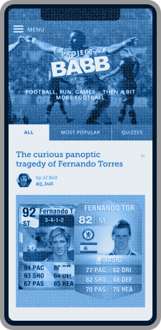
In just under a month we produced a completely new site for the project, with lots of unique functionality like quiz engines. In a team of two I worked on the design and front end build of the site. It was a big success and helped inform the Telegraph for their subsequent digital transformation.
There is a very detailed case study here from one of my colleagues that looks at the project from a more back end view. It remains one of the most fun and interesting projects that I've worked on.
International Gender Champions
Commissioned by the UN in Geneva, Women at the Table and the US Mission to the UN. Our brief was to build a piece of custom software; a Tracker to allow Champions and their staff (or Focal Points) to engage with the project, submit their commitments and complete surveys.
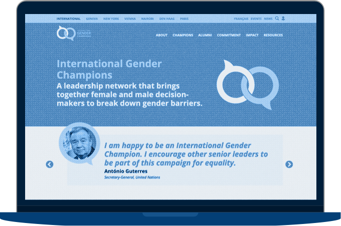
I've been involved with the look and feel of the site and some work around the UX of the system the delegates use to fill in surveys.
Worktech Academy
We've been working with Worktech Academy since the very start. Since Jeremy Myerson (the first-ever holder of the Helen Hamlyn Chair of Design at the Royal College of Art) contacted us about his new project around the world of workspaces.
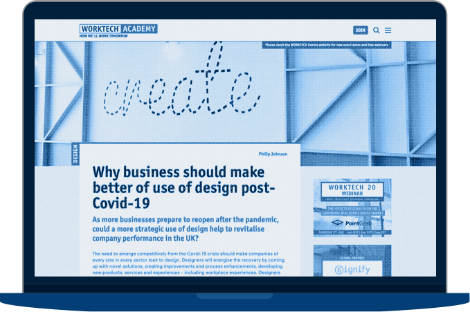
We were involved in every aspect of the online aspect of the business and I, with direction from Jeremy, have been responsible for everything from pieces of branding, to their web design, their digital workflows and more.
Whitley Fund for Nature
The Whitley Fund for Nature is a wildlife charity that we work with. We have provided them with a site for a number of years as part of giving something back.
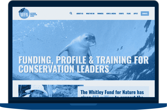
We worked closely with them to deliver a new site for the 25th year. I led the design and oversaw the build.
Standfirst
At interconnect/it we are classically a company that works with WordPress as a platform to help publishers get their content online. Over the past couple of years we have been working hard on a platform that leans on our years of experience to deliver an all-in-one platform for organisations that don't have the financial clout but still need a robust platform to thrive in a digital world.
I have spent a lot of time refining a design system that allows us to rapidly and flexibly deliver bespoke, scalable news and publishing websites. I've been leading the design element and have had significant input into the front-end code. It's been a really useful project that has given us a really good base to produce affordable, high quality sites for our clients.
Family Capital
Family Capital is an "online publishing company dedicated to the global family enterprise sector". It's essentially a one-man-band operating effectively in a small niche. Using Standfirst we were able to deliver a great looking site that was tailored to fit publication in just a few days. Since launching we have worked to introduce a metered pay wall which has seen great growth for the site. They have gone from nothing to a six figure turnover using our technology and experience.
Sniff Petrol
Sniff Petrol is Richard Porter the ex-script editor from Top Gear, now of The Grand Tour. Sniff Petrol is his creative writing outlet - 'Car based drivel'. It's aesthetic is delibrately ... wonky ... as you'll see from Richard's photoshopping skills. Richard has a pretty big following on Twitter and his stuff tends to get viral spikes. Standfirst is great for that.
Standpoint
Our successful work with The Spectator got us noticed with a lot of similar publications. A lot of times we have the breif which is basically "The Spectator, but for a fraction of the budget". Standfirst gives us the ability to deliver that. We worked with Standpoint to migrate away from an ancient site and CMS and deliver an up-to-date, good looking, performant site.
The Critic
After some behind the scenes changes the people that hired us for Standpoint left and founded their own publication - The Critic. They were so impressed with the work we produced then that they chose us to help launch their new publications site. We were involved right from the very start to produce a site or the launch day of the magazine.
Shhhhhhh
A project for a UK version of a large, American Geographic publishing organisation that I can't talk about. That didn't get launched because another huge American entertainment giant bought them and changed direction a week before launch. I'm not bitter.
