Skeuomorphs. They're not for you.
The vocal inhabitants of the internet have spoken. Skeumorphs suck. Apparently they are stupid, lazy design. Well I have news, they aren’t really aimed at you.
Note: This article was first published on September 19, 2012. It's a long time since skeuomorphism was the hot topic. The piece still makes sense. And it will still make sense the next time overly detailed faux leather filofaxes are a design decision. It will happen.
Skewawot?
Skeuomorph (pronounced skew-o-morf) is a lovely sounding word coined by a 19th century archaeologist. Basically it describes a form of visual metaphor. More specifically it is defined as:
“an object or feature which imitates the design of a similar artefact in another material.”
It is derived from the Greek skeuos (container, implement) and morphe (form). Originally it was to describe the features from stone columns, and how they bore the same characteristics as those carved in other materials such as wood. It was seemingly intentioned to be very specific in it’s definition. However, over the years it has evolved to come to describe the practice of taking visual cues from old artefacts and incorporating them into new objects – even when those features don’t necessarily perform any useful function any more. Classic examples are:
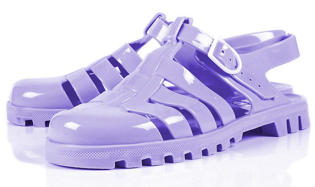
Plastic ‘Jelly’ Sandals.

Jelly sandals are moulded out of a single piece of plastic. There is absolutely no technical, or physical, reason for them to look like sandals produced from individual strips of leather. Like the Romans wore.
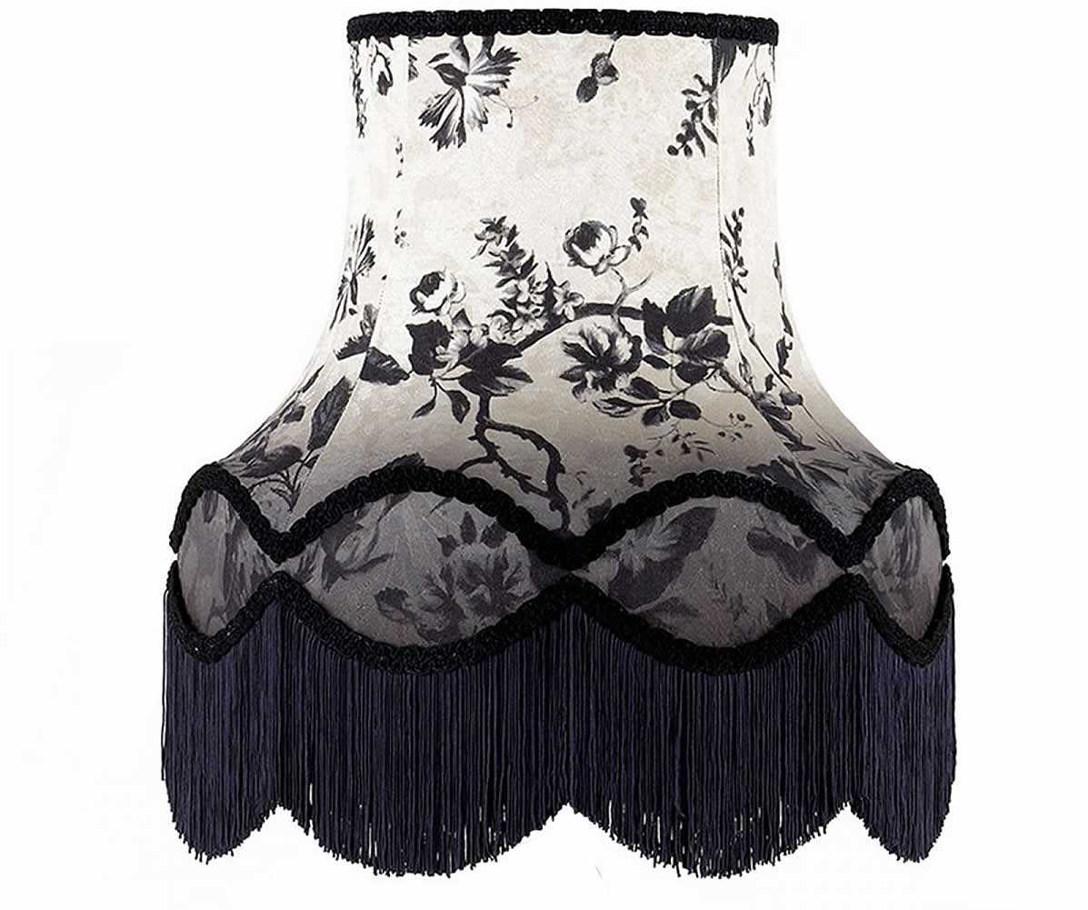
Lampshades

There is no functional need for lampshades in modern life. They existed to protect a flickering living flame from pesky breezes. Edison, however, knew he needed to promote his lightbulbs in such a way as to be acceptable to a skeptical society. So they still thrive today.
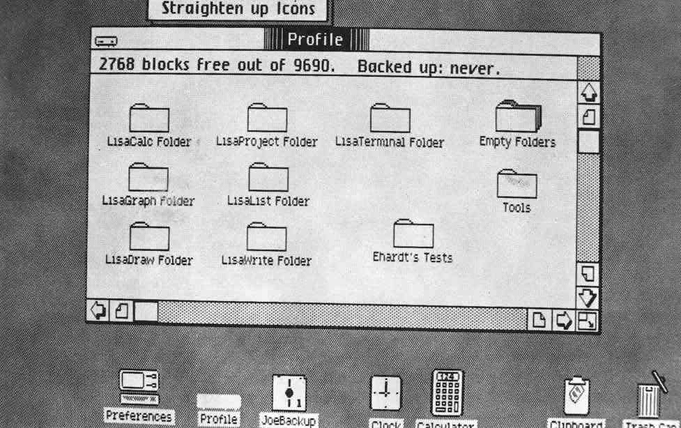
The Desktop

Before modern graphical user interfaces were invented by Xerox (and popularised by Apple and Microsoft), computers were a forboding black screen with a blinking cursor. GUIs brought us a smorgasboard of skeuomorphic delight including digital desktops, trash cans, folders, buttons and much, much more. Thus smoothing the way for personal computers to take over the world.
Apple and Skeuomorphs
This brings us rather neatly to the main thrust of the article, and the entire reason that skeuomorph has become such a well trodden word over the past couple of years – Apple.
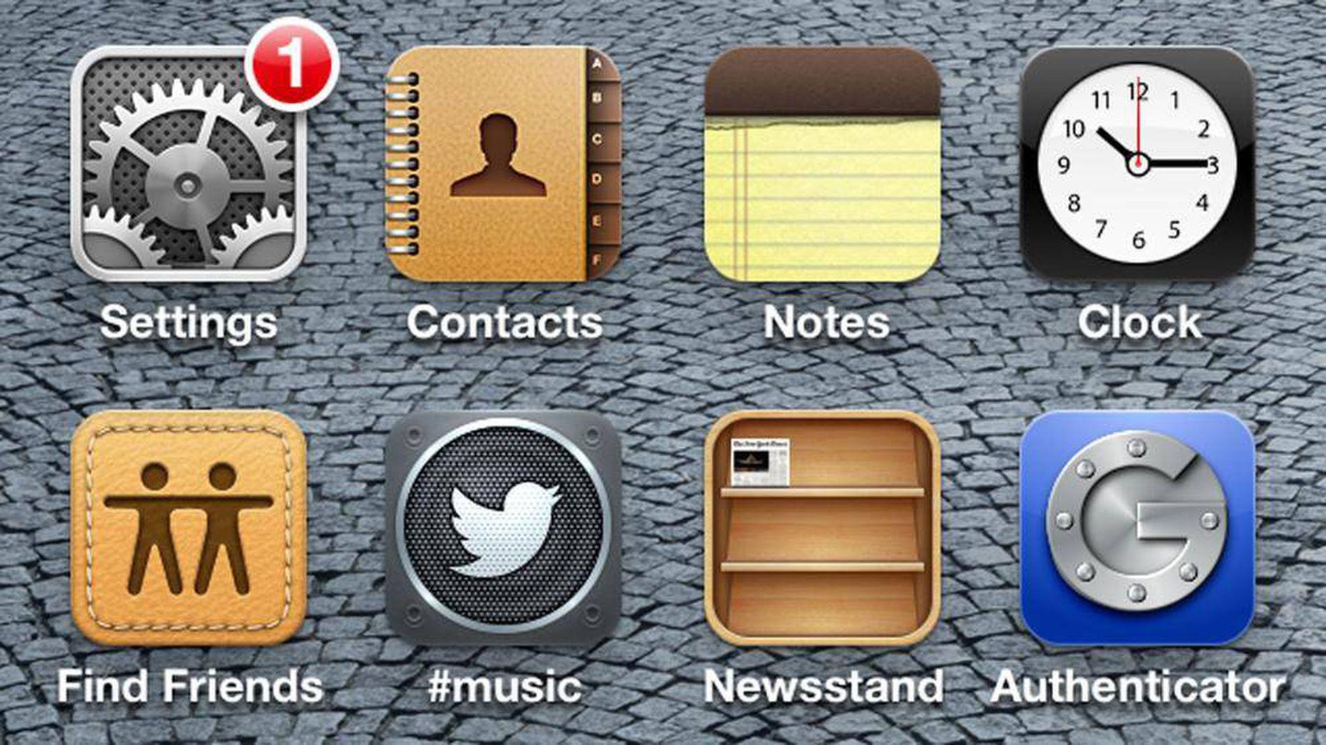
More specifically, this kind of thing:

Apple, in case you hadn’t noticed, are following a path of overtly skeuomorphic design. In a big way.
Some of the design choices are corny. With some you can question the execution. Others work rather well. What you can’t do, however, is question the design, social and marketing reasons to why these choices have been made.
For years the professional design and computer users of this world made up a massive proportion of Apple’s comparatively meagre user base. A userbase very comfortable with computers, people that have been using computers for very specific jobs every single day of their working lives.
Just a design solution
Apples market is a bit different now. They have sold 84+ million iPads, 230+ million iPhones and Lord knows how many million other iOS devices. They are selling machines to your mum, your dad, your granny, your sons, your daughters, your nieces, your nephews. Everyone.
These are people that haven’t ever used a digital calendar app. Or used a tablet to keep notes. Or even used a computer – ever. That has given Apple a very traditional design problem to solve. Their answer is skeuomorhs. Lots of skeuomorphs.
History has shown us this is a proven technique for smoothing the way to social acceptance. You might not personally like them, you may think they are lazy, you make think they are cheesy. You might not even be a fan of the execution. All that is totally fine.
What you shouldn’t be doing is questioning the why of travelling down this path. It might come as a surprise, but Apple employ some of the most talented people in the world. The market share figures and oceans of spare change that slosh around in their vaults point to the fact they might be doing something right.
They know exactly what they are doing.
They just aren’t doing it specifically for you any more.
Careful now
The danger for Apple is that the skeuomorph look becomes so ingrained in their output as to become a hinderance. There are signs that could become the case if they aren’t careful. For instance, already not all of Apple’s skeuomorphs make sense. Whether you like it or not, Calendar App looks and works well. It fulfils it’s purpose as being inviting to brand new users, and being usable. So does Reminders, and even Notes.

However, it becomes harder to see the benefits of apps like Find my Friends. There is obviously no direct real-world equivalent and the leather textures feel forced. In that regard it’s not even strictly a skeuomorph – but it’s definitely heavily influenced by their other works. Almost as if they have done it for the sake of it rather than to solve any particular design problem.
There is also the issue that whatever Apple does, a million designer and developers follow. These people won’t be using skeuomorphs for any other reason other than Apple do. They will generally be much poorer in execution.
Which will ultimately perpetuate the myth that all skeomorphs are bad.
Not the problem
What I’m trying to get across is that skeumorphs in themselves are not bad. In fact they are very useful tools. The problem is that we are so used to seeing Apple leading the way with forward thinking designs that challenge the mainstream norm.
You have to remember that Apple are the mainstream norm now.
Skeuomorphs help make the mainstream accept new technologies. It’s a simple fact. Once people are comfortable with new technologies it should be that the skeuomorphs will eventually become diluted over time.
Flip Flop
In a somewhat ironic turn of events the more informed, computer literate, geeky, and technology tuned people of this world have to look to Microsoft, of all people, to see a more nuanced approach to modern UI design.
Their ‘Mosaic’ UI has been highly praised from various critics over the past year or so. Microsoft can do this because they have only sold a (very) relative handful of phones using their new mobile OS. In this arena Microsoft are the plucky underdog catering for the professionally geeky minority. It will be interesting to see how this acceptance transfers into Windows 8.
Basically.
So that’s my rant.
It annoys me to see statements like… well just search Twitter for the word skeuomorph and you’ll see the kind of throw away comments.
To say skeuomorphs are bad you may as well just say all minimalist design is bad. Or all designs using the colour purple are bad.
A skeuomorph is just a design solution.Like with all designs solutions as long as you can back up why you have chosen to go down that route, and it solves the projects problems, then it is a perfectly acceptable technique to use.
For Apple their penchant for skeuomorphs should be a means to an end. In fact I’ve read rumours that they were beeing pushed heavily by Steve Jobs himself before his death. Certainly reading the story of Edison and the lightbulb you can see where he was coming from.
You might not like skeuomorphs, or their aesthetic, but they certainly seem to work.
